This was an app designed in a single morning design sprint. The goal was to design for clarity over completeness.
This is a MENSA inspired/high I.Q. mobile application. For senior UI/UX designers, it is actually a positive signal when a designer can condense an MVP to 14 pages rather than a “40 page bloated fantasy app.” It is actually better to start lean and expand the mobile application outwards.
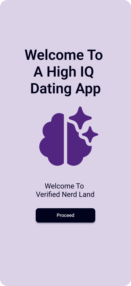
Designing a Dating App for High-IQ Communities
We're a speculative product concept exploring cognitive-first matching, minimal UI, and ethical monetization for high-intelligence communities.

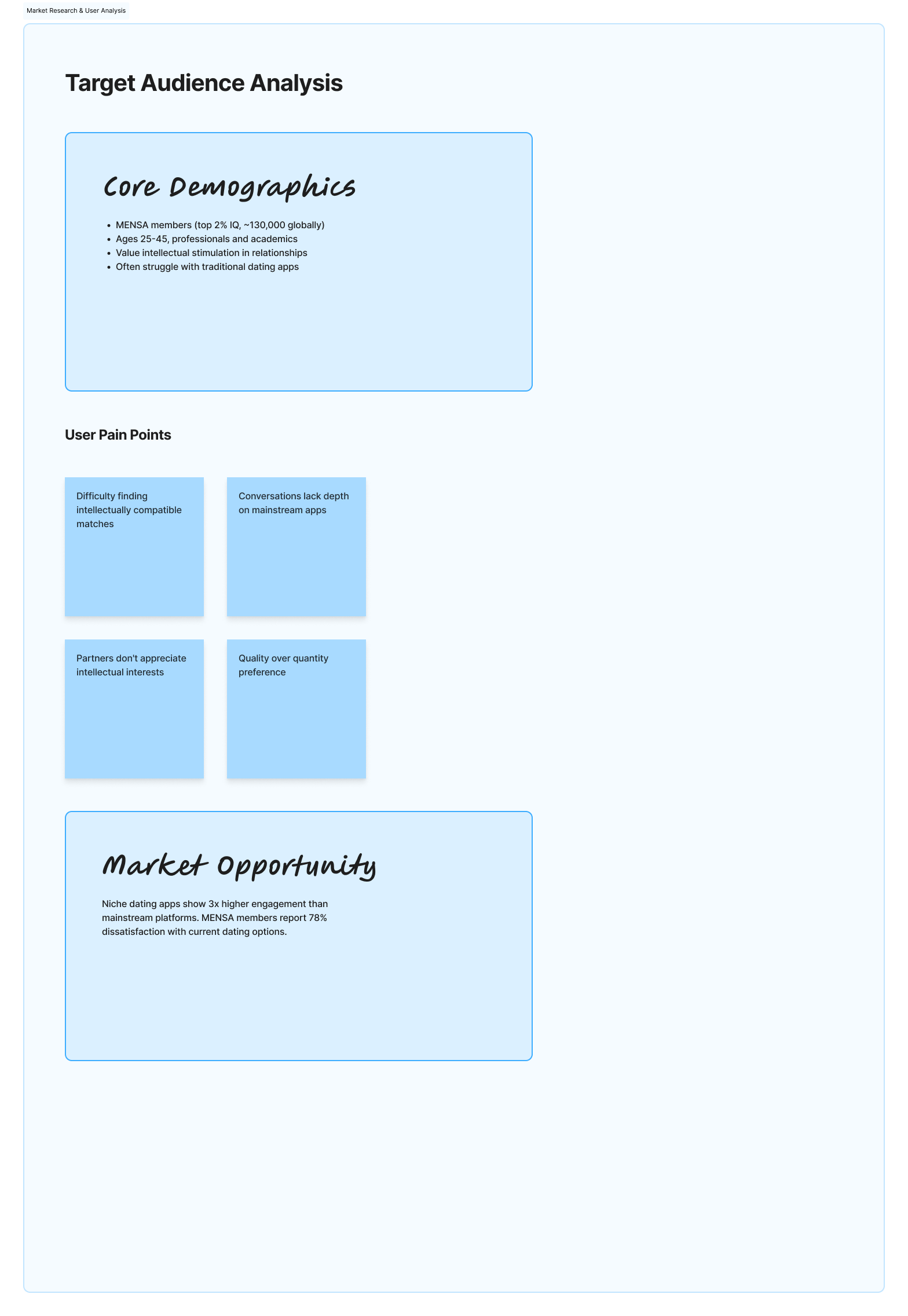
Why do special considerations need to be implemented for users with high cognitive abilities?
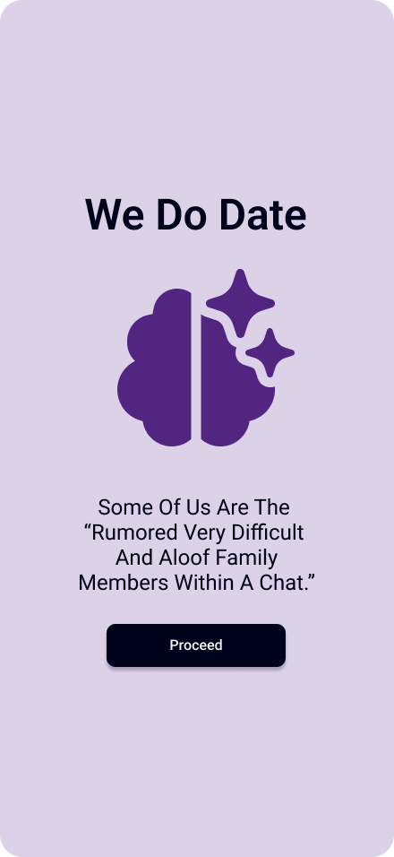
High-cognitive-ability users often report frustration with mainstream dating apps that prioritize visual engagement, rapid swiping, and shallow signals over intellectual compatibility, communication style, and depth of thinking.

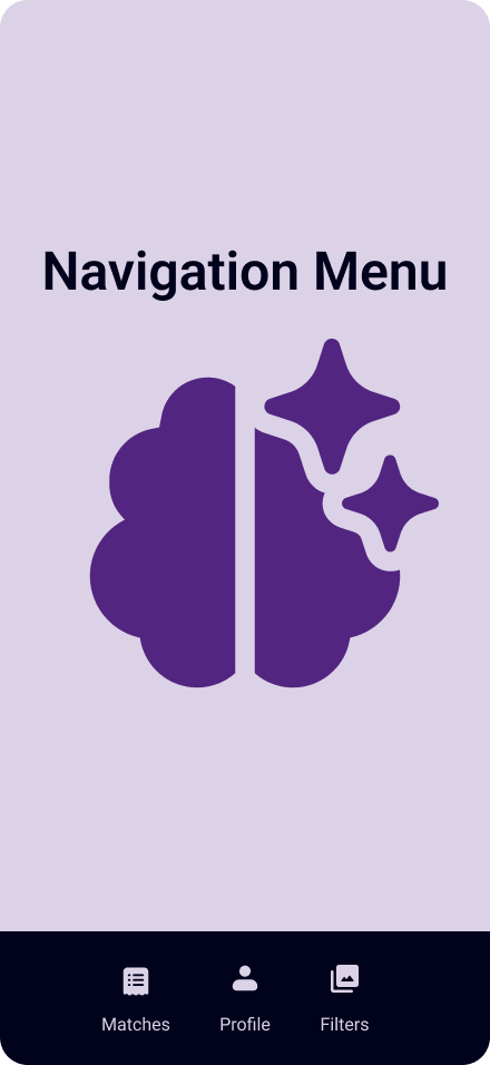
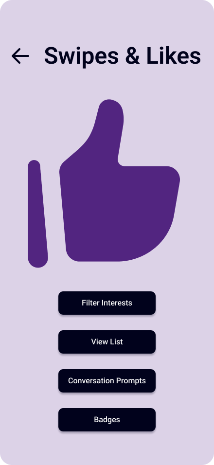
Design Constraints [This Is Where A Design Really Shows It’s Strength].
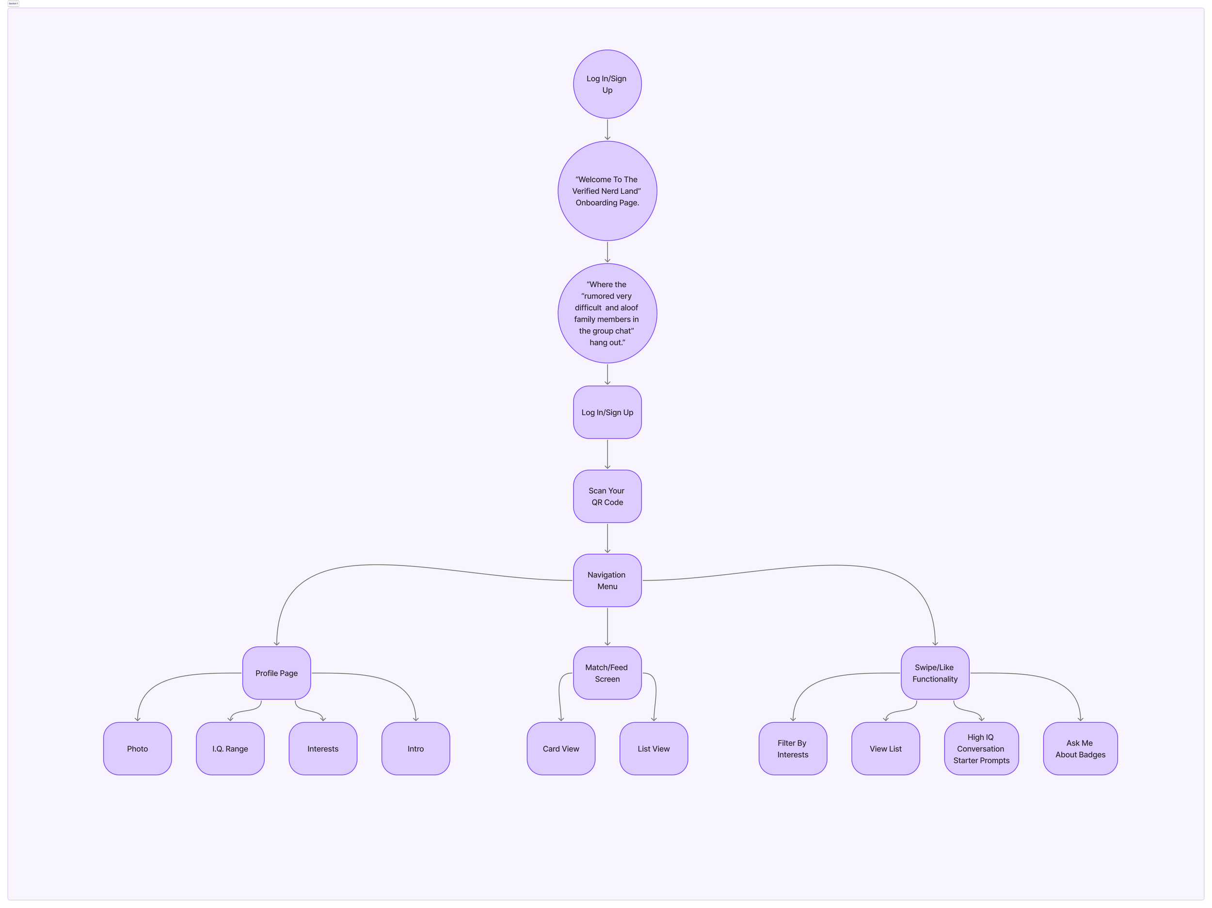
Designed as a 14 page MVP. This prioritized clarity over feature volume. This app avoids dark patterns, dopamine loops, and swipe addiction. Monetization had to feel ethical and optional.
Remember that a lean app is a signal that “this is true senior level design thinking”.
Rather than expanding page count, complexity was handled through cards, modals, and progressive disclosure.

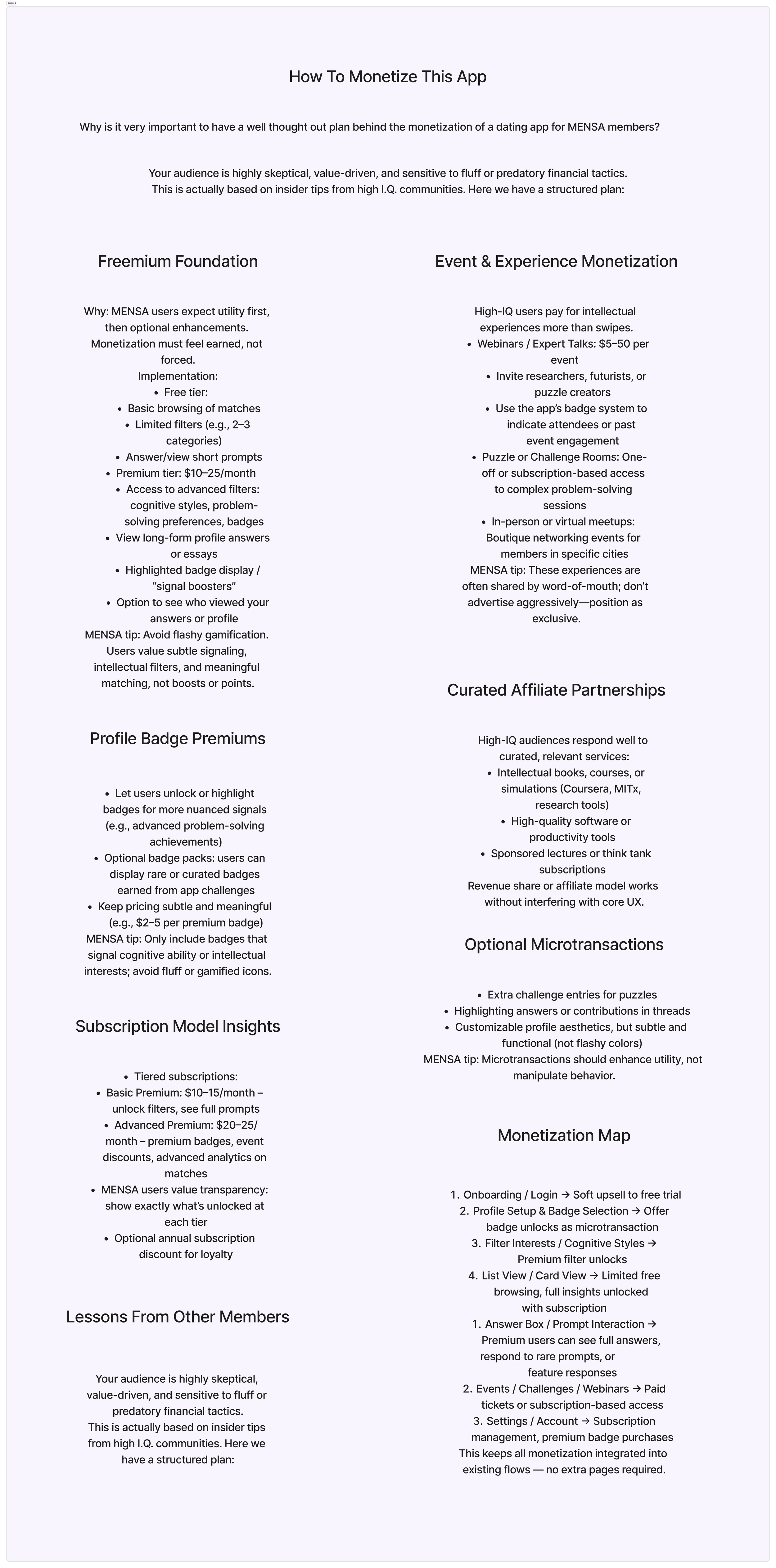
Monetization Strategy [Ethical & MENSA aligned].
Designed to respect user intelligence and autonomy:
Freemium access to core functionality
Paid access to advanced filters and cognitive insights
Optional intellectual events and challenges
No ads, no boosts, no manipulative scarcity
Monetization was integrated into existing flows to avoid expanding page count or interrupting core experiences.

Our audience definition.
Our target audience is for users who value intellectual compatibility, depth of conversation, nuanced self expression, and low-noise, low-gamification interfaces.

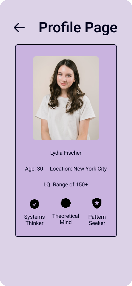
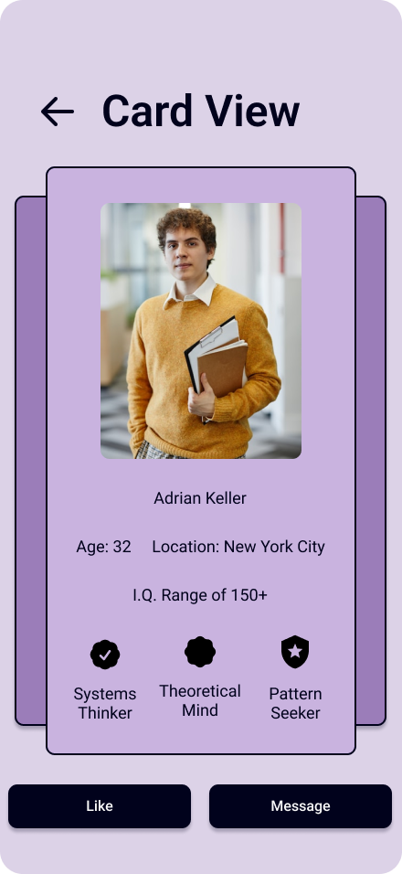
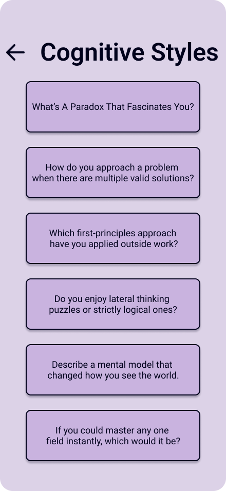
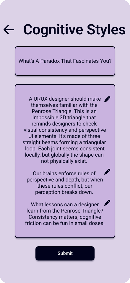
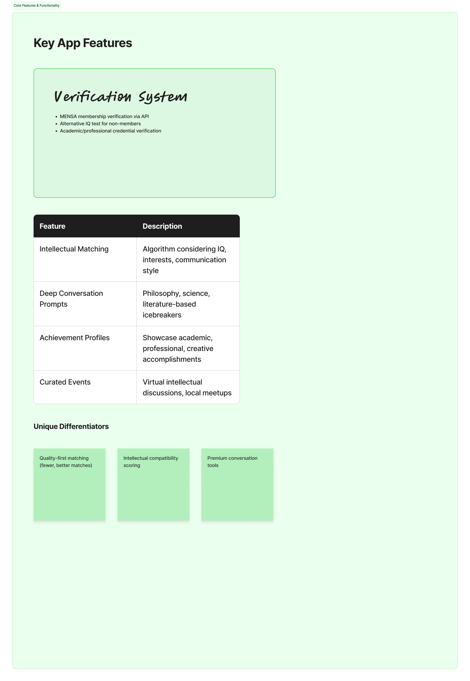
Cognitive First UX Decisions.
Reduced visual noise to lower cognitive fatigue
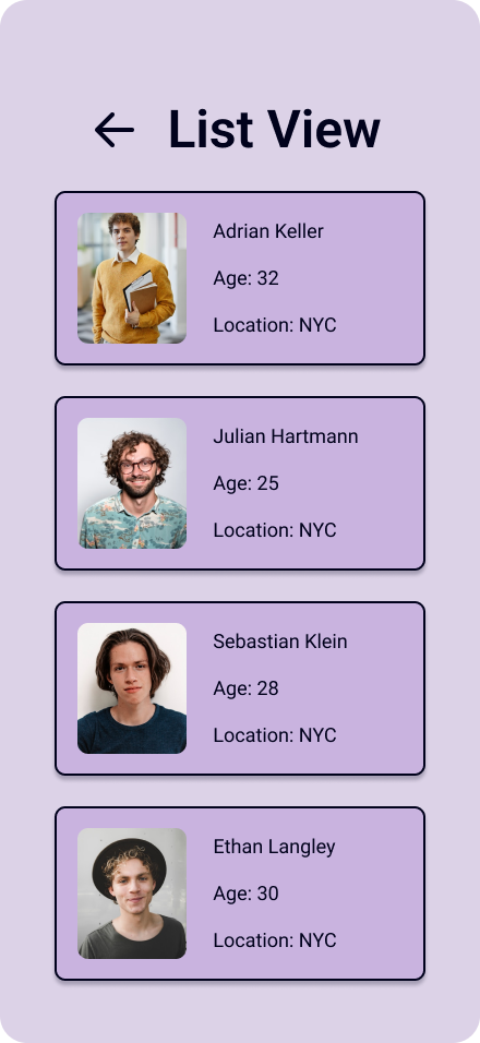
Used text-forward layouts over image-dominant ones
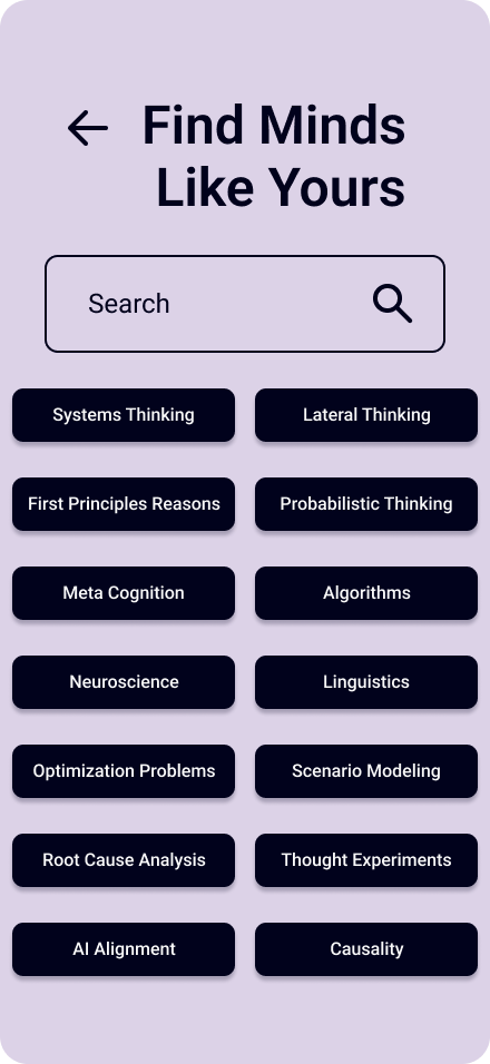
Designed filters around how people think, not just hobbies
Limited choice density to avoid analysis paralysis
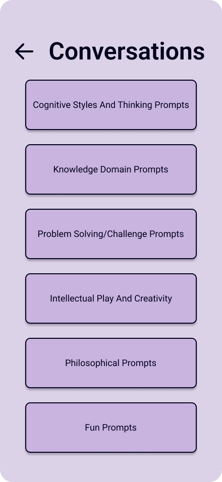
Prioritized long-form answers over swipe velocity

Disclaimer.
This project is an independent, speculative UX case study.
It is not affiliated with, endorsed by, or produced for MENSA®, and references to high-IQ communities are conceptual in nature.