Make it stand out.
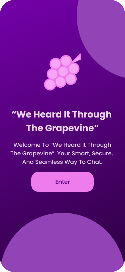
Heard It Through The Grape Vine
This app is geared towards working professionals in the New York City Metro Area who rely heavily on digital communication tools in order to stay connected with colleagues, clients, and collaborators. “Heard It Through The Grape Vine” is a fun, slightly retro and 90’s-esque communication and gaming app that is perfect for subway or bus rides.
Phase One:
“This app was designed to create a MVP for the pre-launch phase of the app [0-3 Months]. The goal is to test core functionality and test with core adopters of the app. This means that the target metric for user downloads is 500-5000 downloads. This will depend on the niche and outreach [friends, mailing lists, and beta testers]. So the key metric is retention and feedback, not volume.
1. Overview
A quick snapshot of the project.
Project Name: Heard It Through The Grape Vine.
Timeline: 1 Day.
Role: Primary UI/UX Designer.
Tools Used: Figma.
Deliverables: 200+ Figma Screens And A Clickable Prototype.
2. Problem Statement
What was the challenge? What prompted this project?
Describe the user or business problem.
Highlight key frustrations or gaps in the original experience (if redesign).
Add 1–2 quotes from users or stakeholders if available.
3. Goals & Objectives
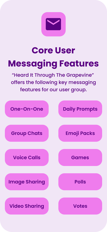
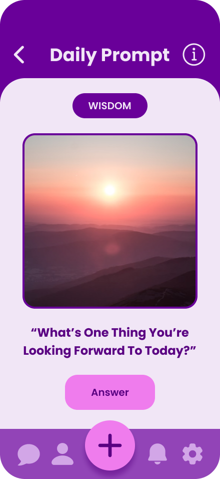
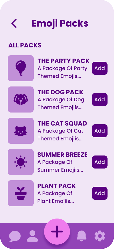
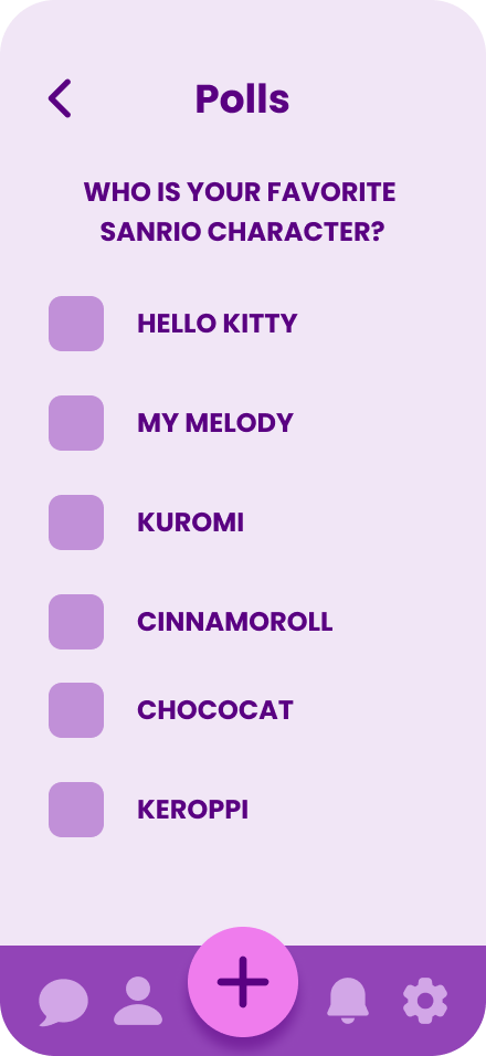
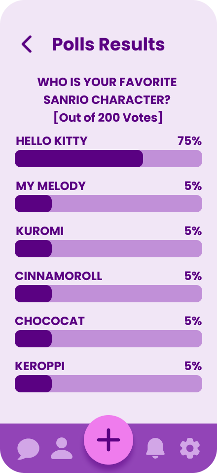
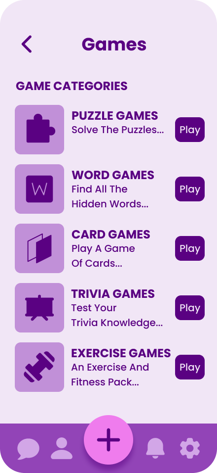
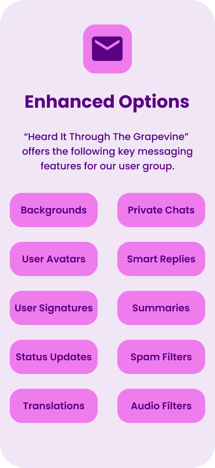
The goal of this app is to to create a hub for organized chat threads, streamlined communications systems, good integration systems, and a cute, fun, and retro little “hub” for mobile games. This app is being created for the “Pre-Seed” and “Seed Fundraising” context of the app.
Improves speed and clarity of communication.
Investors do not expect millions of downloads at the seed stage.
The goal is to focus on strong early retention [e.g., 40%+ Day 7 is key]
Clear, growing user interest (steady organic growth > paid installs)
Benchmark For A Strong Seed-Stage App: “10,000+ downloads with 25%-40% retention and organic growth.”
4. User Research
Summarize your discovery phase.
Methods used: Quantitative Methods and Qualitative Methods to gain insights on Behavioral Data. Utilizing app store and review mining tools like Appbot, Google Play Console, and Apple Analytics. Data was also taken a combination of user surveys and data analytics studies about users in the New York City Metro Area.
Key user insights: Working Professionals in the New York City Area value a communication app that respects their data privacy, information overload, and minimizing unnecessary distractions.
Key user concerns: There are a lot of blurred boundaries between working and personal life. Professionals in the New York City Metro area value discreet, efficient, and secure communication that respects both their time and privacy.
Users seek a communication tool that supports focused work, allows clear boundaries between work and personal life, and provide greater transparency and control over how their data is handled.
5. UX Strategy & Information Architecture
How did you structure the solution?
Site map or app flow diagram
Wireframes (100 Initial Low Fidelity Wireframes in Grey Scale)
The UX Strategy is to optimize Discretion & Professionalism
Working professionals in the NYC area often multitask across devices in public or shared spaces (co-working spaces, subways, stores, and cafes)
1. Discretion & Professionalism
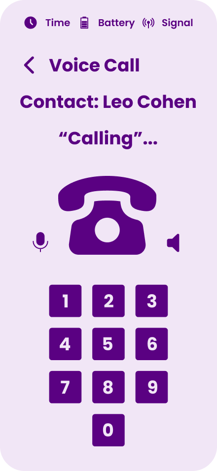
Working professionals in NYC often multitask across devices in public or shared spaces (e.g., co-working spaces, subways, cafes). A clean, retro-inspired split-screen layout mimicking an old terminal or pager:
Reduces visual noise
Avoids attracting attention from passersby
Feels familiar but not corporate
6. UI Design & Visual Style
Explain how you brought it to life visually.
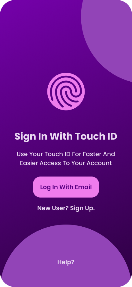
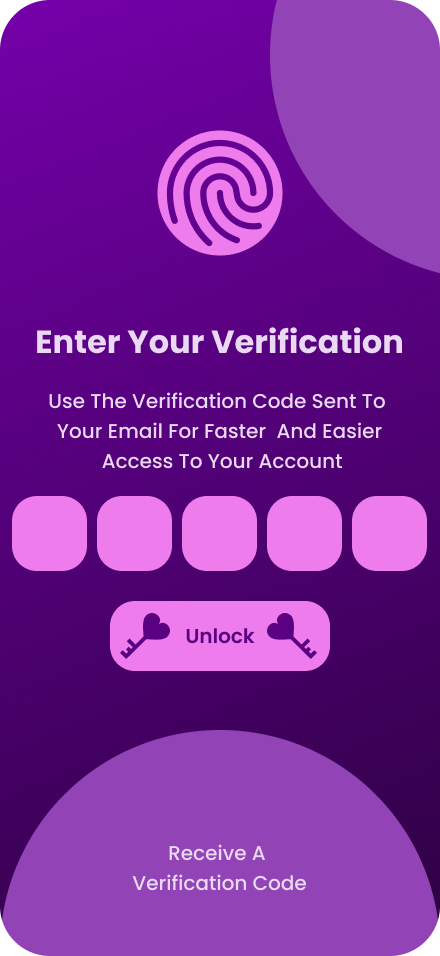
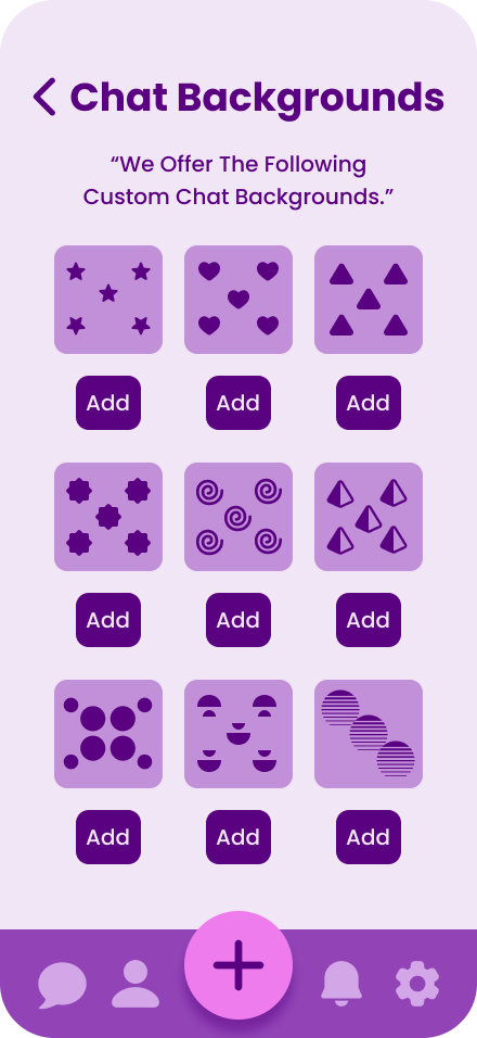
This app was designed with a clean, retro-inspired split-screen layout that can mimic an old terminal or pager.
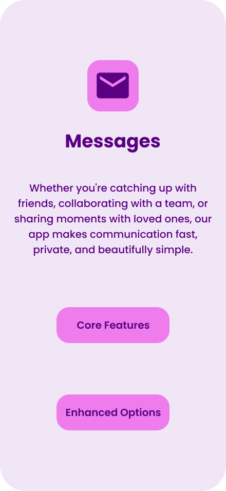
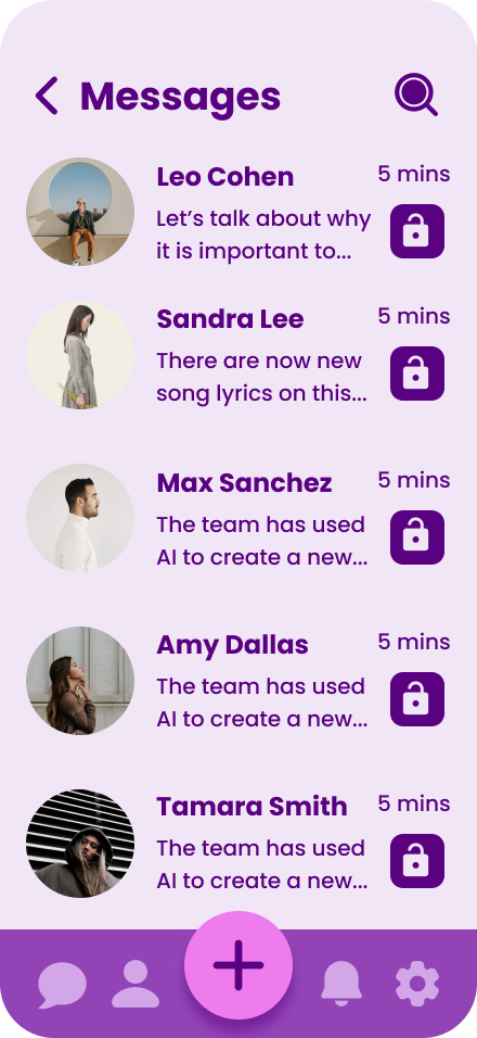
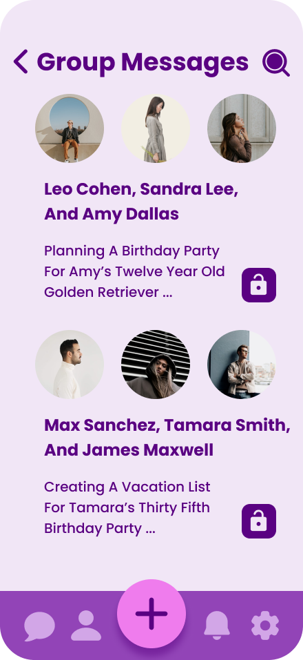
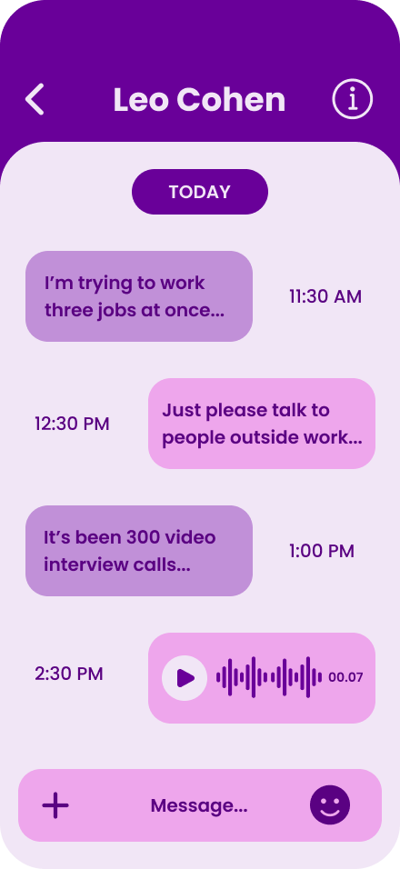
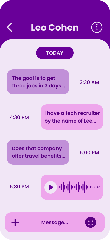
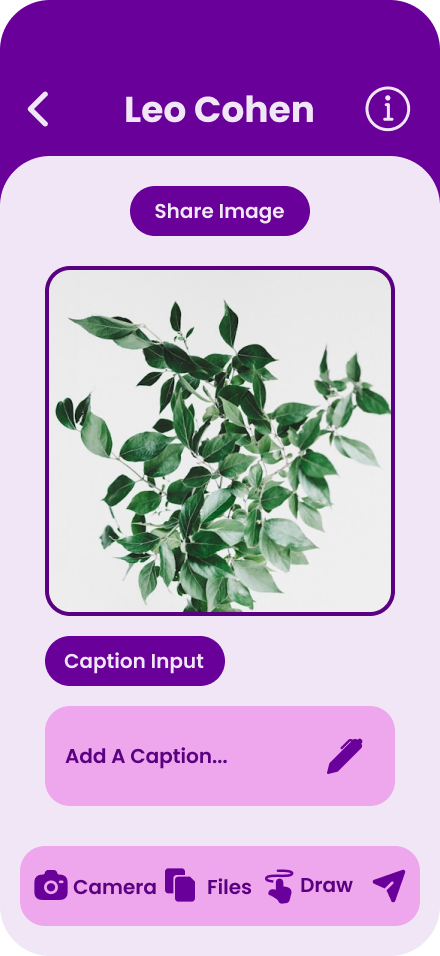
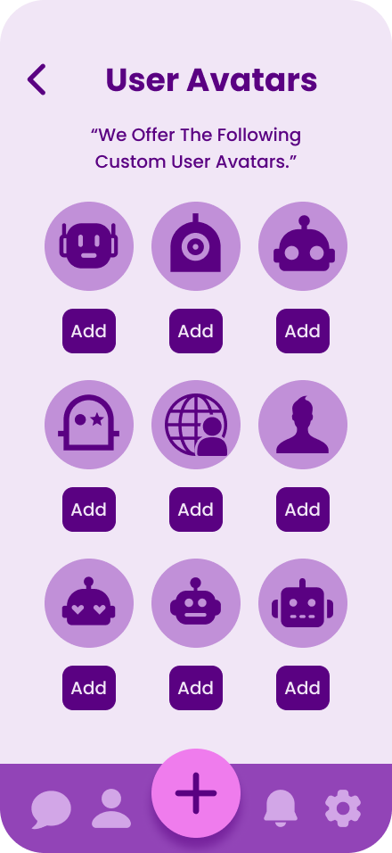
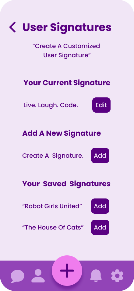
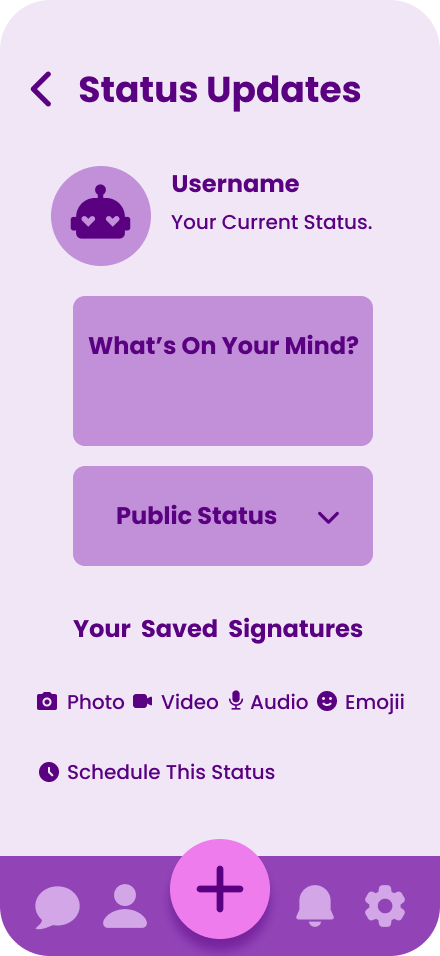
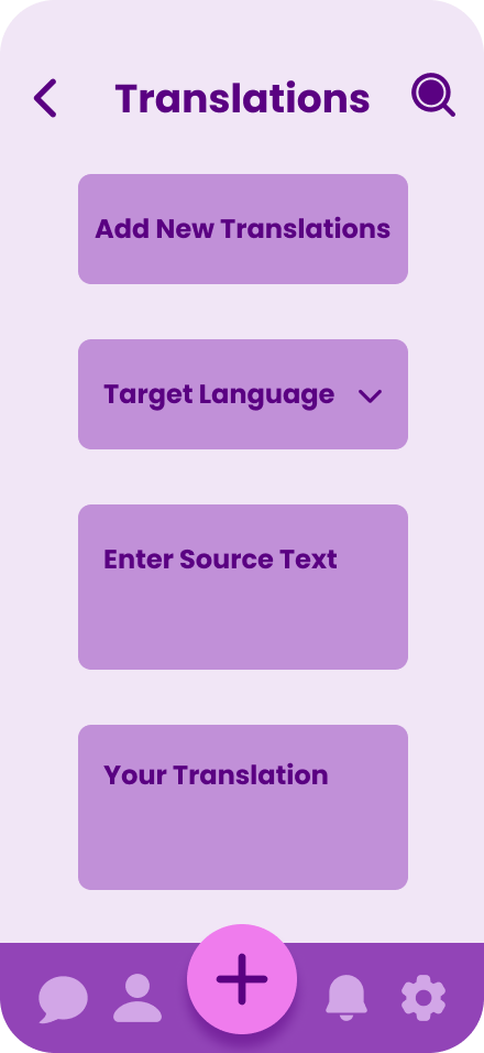
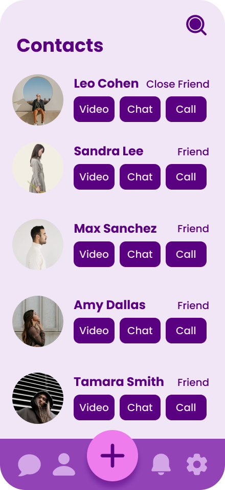
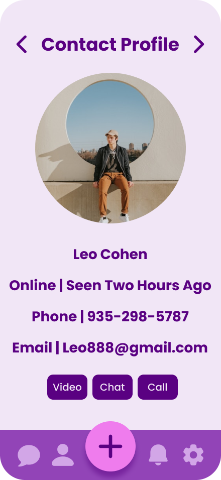
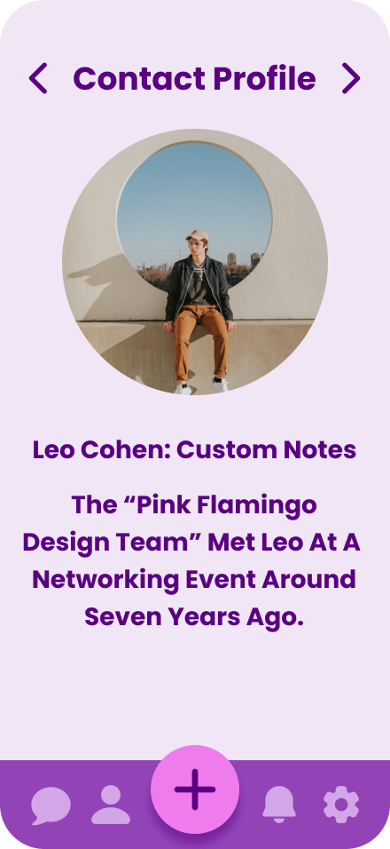
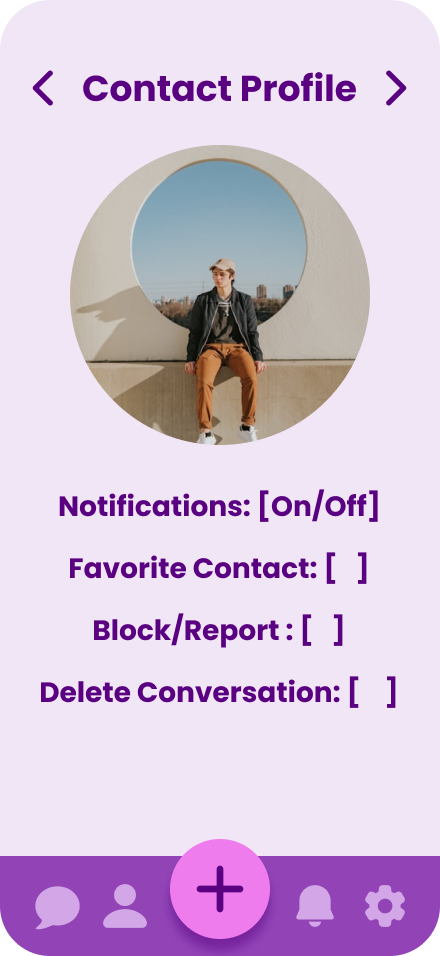
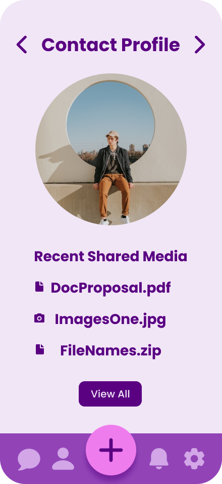
Color palette: #5A0182, #EF7CED, #9244B7, #F1E6F6, #C190D8, and #EEA6EC. Typography: Poppins. UI components: Conversation Lists, Message Thread View, and a Navigation Bar/Tab Bar.
Accessibility considerations: Reduces Visual Noice, Avoids Attracting Attention From Passersby, and Feels familiar but not corporate.
200+ pages of Hi-fidelity mockups and a fully functional clickable prototype.
7. Design Process Highlights
Show iterations and rationale.
Explored aesthetic cues from old pagers, typewritter fonts, Palm Pilot and command line UI’s.
Prototyped key flows for onboarding, new messages, and switching threads.
Created a style that felt both minimal and nostalgic, while maintaining modern responsiveness.